Design thinking is fast becoming a trend in startups and corporates alike as the need to constantly innovate in order to stay relevant and ahead of your competitors grows. Product design/UX research/UX design is consequently turning into a highly sort after skill in most organizations. As companies move from focusing on solutions and ideas that come from the business and instead shift their efforts to focus on real problems affecting real users, it is important to understand that this will mean occasionally moving your high-demand roles out of your office.
Design thinking places high emphasis on empathizing with your users and immersing yourself in their environment to better understand their motivations and aspirations, so unless your users are your colleagues, design thinking is not a cubicle job.
We recently completed a design and software development project for one of our clients, based in South Sudan and the successful launch of this project was a good reminder of the importance of empathic research when designing solutions.
The Case Study
War Child Holland have a number of projects in South Sudan focusing on psychosocial support to war-affected children in what they call child-friendly spaces (CFS). They invest in a peaceful future for children and young people affected by armed conflict by using creative and involving approaches to learning. One of their innovation projects is looking at improving feedback in the communities they work and in making people aware of the grave violations of international humanitarian law and how to report this. War Child was looking to accomplish this using a digital solution and approached iHub Software Consulting (iSC) to be their design and development partner.
Having worked closely with these communities for some time, War Child had an idea of what the key components of the digital solution would be. These included:
- A smiley-based satisfaction survey tool where children participating in different activities at the CFSs could share their feedback
- An accountability learning tool that will allow people to learn and get encouraged to give feedback.
- An E-feedback tool that allows different people in the community to give feedback
This proved to be an exciting challenge for us and we proposed using a Human Centered Design (HCD) approach, which we highly vouch for in majority of our projects. We want to understand the people we are building for, so that we can build the right product for them. With that in mind, we kicked off this project with a UX research study in South Sudan.
1. User Research in Malakal, South Sudan
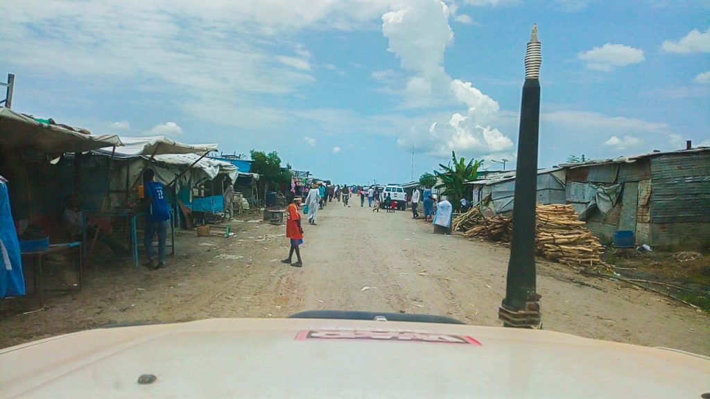
To design the right kind of products that are delightful to use, you need to understand the relevant parts of your users’ lives. What do they do? What do they think? What do they feel? What do they say? One of the most powerful ways of gathering this information is by observing and talking to people. At iSC we do this through contextual inquiry. Two UX researchers traveled to Malakal for a couple of days to immerse themselves in the communities in which War Child works. We spent time with the communities in the CFS centers at the Protection of Civilians (POC) site, in Malakal town and at the Humanitarian Hub where War Child staff are based, observing and interviewing potential users of the digital solution.
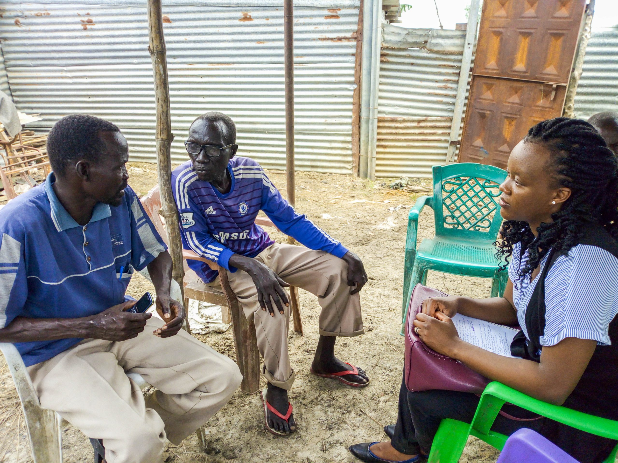
We spoke to the children attending classes at the CFSs to understand their aspirations, we spoke to adults in the Child Protection Committee to understand the challenges they face while reporting issues they identify in the community and we spoke to classroom facilitators and volunteers who spend the bulk of their day with the children at the CFS centers.
From this study we were able to note several things that would shape the direction the project would take:
- There are very low written and digital literacy levels among the users. How might we design a solution that was intuitive and simple to use for these users?
- Poor network connectivity and coverage in the CFS. It was almost impossible to get online in any of the sites we visited and in one of the project sites even impossible to make any phone calls. How might we build a solution that can work within these constraints?
- No electricity in homes and schools. This meant that we would need to find alternative ways to power any devices that would be used in these areas.
Rapid prototyping
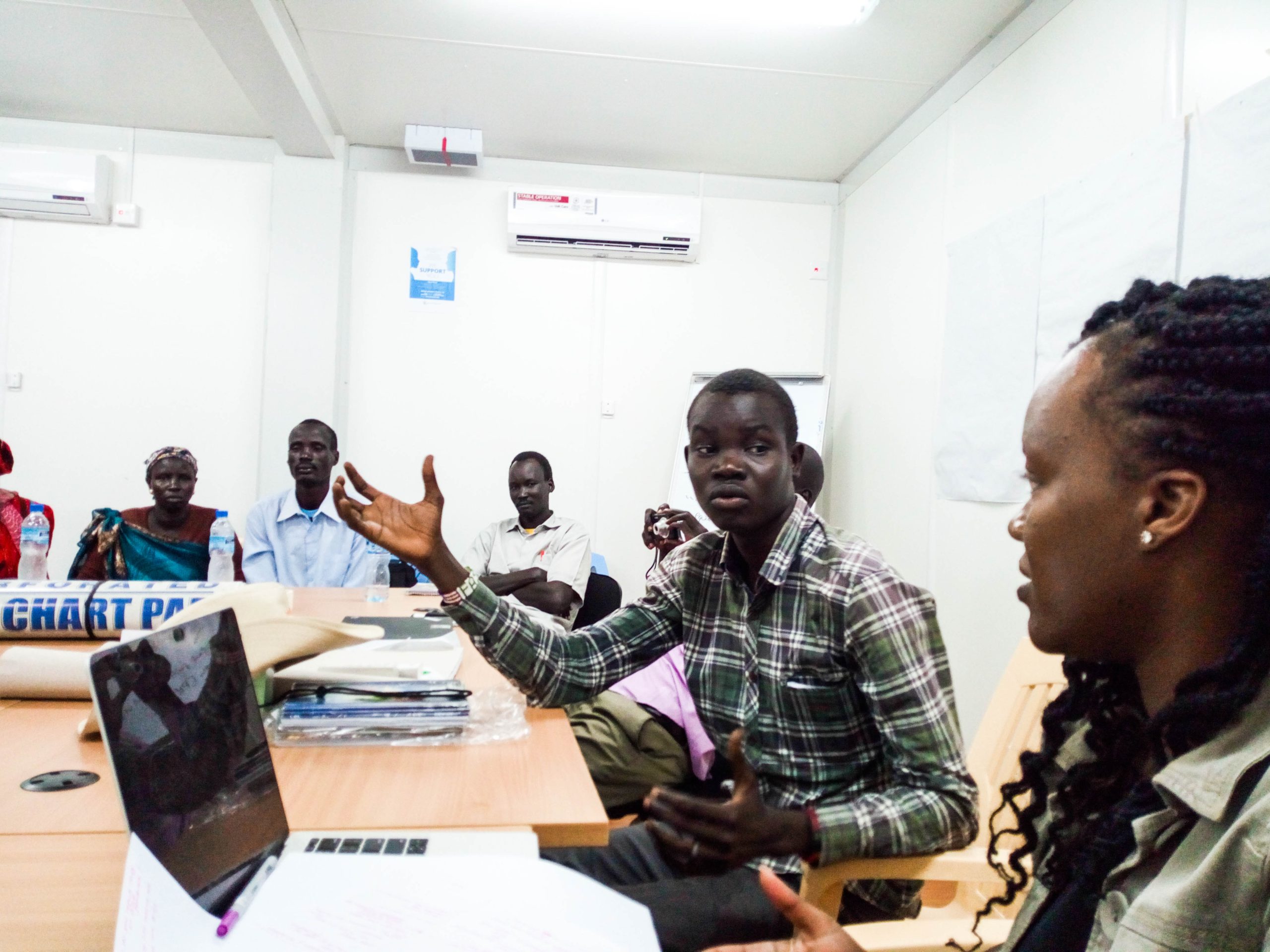
Having gathered a number of insights and ideas from the field research in Malakal, we returned to Nairobi, downloaded these learnings and shared our insights and recommendations with the rest of the team. Now design thinking emphasizes on understanding what is desirable for the user, but to build the right product for the user and the business, it must also be technologically feasible and economically viable. We held a brainstorm session with the rest of the development team that helped us collaboratively design a solution that would work well given the constraints we identified during the field study and which would fit within War Child’s fixed budget.
- To solve the illiteracy problem, we proposed the use of illustrations for the learning module. Users would be be presented with scenario-based illustrations they could easily relate to and then choose a cause of action by pressing one of two options.
- Our field research validated War Child’s assumptions that smileys were an effective method of collecting feedback on user satisfaction. The feedback module targeting children would take this approach.
- The application we would build would have the ability to work offline and store data on the phone until it detected a network connectivity, at which point the data would then be uploaded online to synch with the web-based database
- Solar chargers would be used to charge the tablets where the designed solution would be installed
Rapid prototyping is an iterative process that involves making your ideas tangible so that you can share, get feedback, refine them and push them even further. The lead UX researcher designed low-fidelity wireframes using pen and paper and shared these with the client for feedback. We iterated on this feedback and then moved on to design high-fidelity wireframes. Our creative designer Liz Kagimbi, took the lead on this and we followed the same iterative process, often sharing our designs with War Child using tools such as inVision, which enabled us to collect quick feedback on specific areas in the designs.
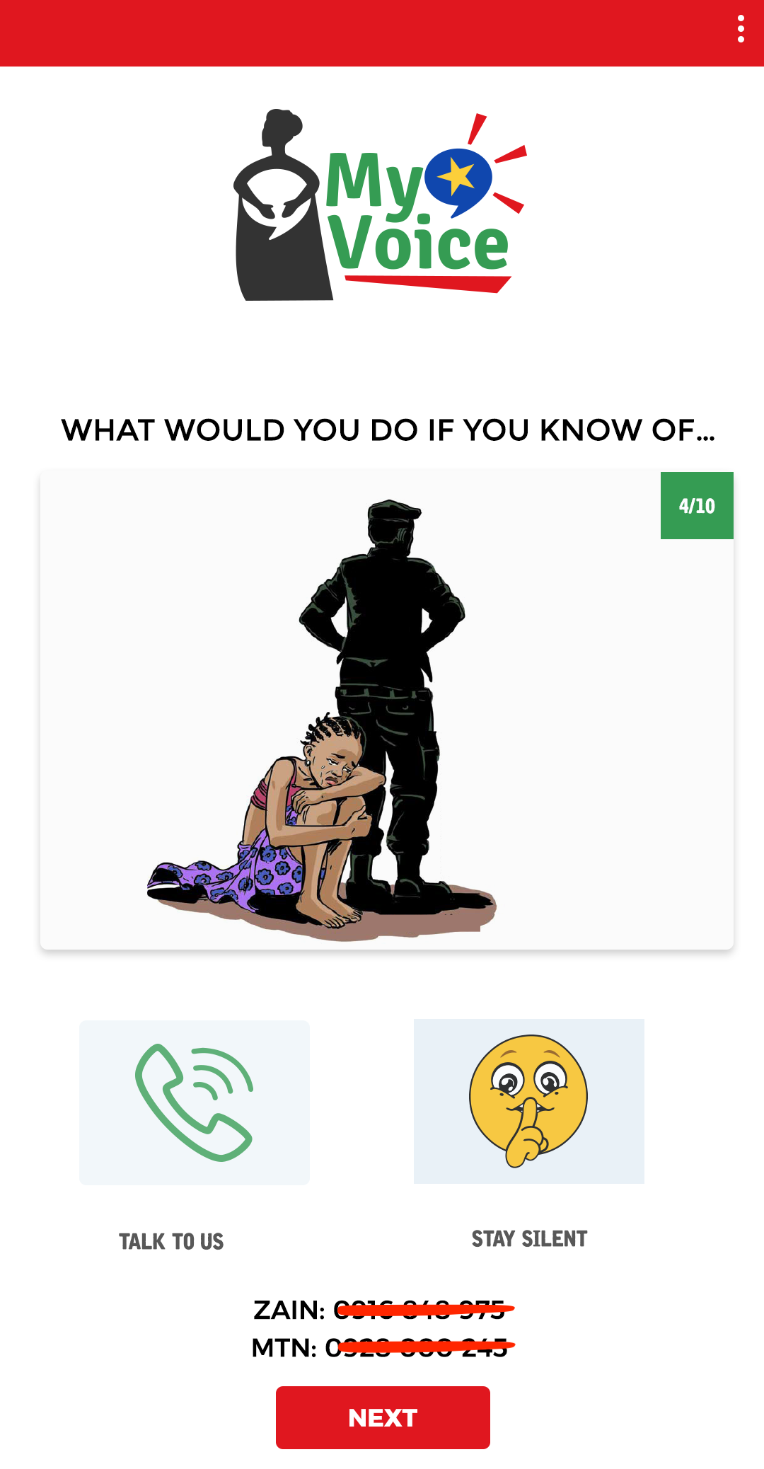
The approved designs were then transitioned to the development team for implementation.
App Implementation
We use an agile development approach when building and shipping software. We use SCRUM, a leading agile framework used by leading tech companies across the world. Our typical sprint is 2 weeks long, and we have daily stand-ups where we share project updates and get to learn about any blockers we can mitigate early. We also hold internal and external demos before the end of the sprint where shippable versions of the applications undergo user acceptance tests.
In a span of 2 months, the able team comprising of John Owuor, who took the lead in developing the Android application and Ansel Melly who developed the API and web dashboard to manage and analyze the data, completed the first testable version of the prototype.
Usability Testing
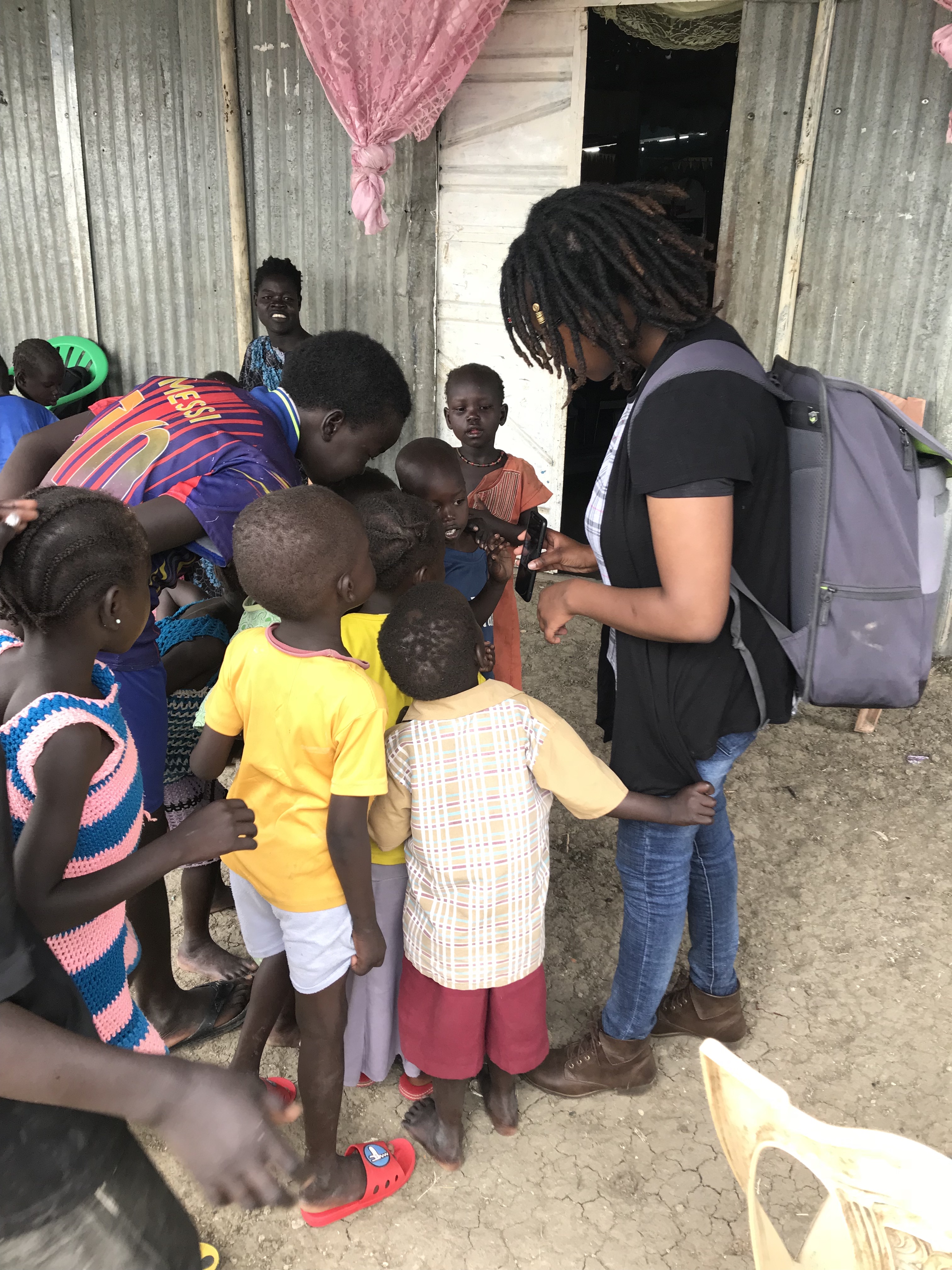
Once development was complete, we stepped out of our cubicles and took the first version of the application to the real users in Malakal. A UX researcher from iSC as well as the lead Android developer traveled to Malakal to conduct a usability test with a representative of the users. The researchers ran the tests with War Child Holland staff, children attending classes at the CFSs and community members. Usability tests are a UX research method used to evaluate how intuitive or easy a product is to use.
Iterating on Feedback
Design thinking is messy and iterative rather than linear. You prototype, test, iterate on the feedback, rinse and repeat. A key take away from the usability test was that although the application heavily relied on illustrations to pass on a message, there were still key components of the application that required users to read text and it was the common case that users struggled through those sections. This is something we would not have easily noted early in the development cycle if we were not in the field observing our users. Together with the client, we decided to integrate audio as an add-on for these type of users.
Other improvements to the application were around the language used in naming certain pages or menus. It is the case that we are very different from the people we are building for and testing the application with real users enabled us to identify what these differences were. Things that would appear obvious to us are at times not obvious to the people we’re designing for, case in point, we added a “Next” button that prompted users to press next to go to the next screen, instead of automatically transitioning them to the next screen.
Pilot
The project is currently in it’s pilot stage and is in use in Malakal, South Sudan, where it is being used to collect feedback within the communities in which War Child Holland runs its programmes. Being in its pilot phase, we are using this opportunity to fix any bugs that may arise and collect feedback on what could be improved for future versions.
— — — — — — — — — — — — — —
The project team included: Joy Kendi on the product design and UX research, Sharon Wangari on the UX research, Elizabeth Wangari on the creative design, John Owuor as the lead Android developer and Ansel Melly as the lead back-end developer.
